8-Bit Cherokee for Video Game Translation
2019 update: I made a non-NES application of this font! Scrollable LED marquees ahoy!
Here's a topic I've been thinking about for a long time. It's really changed the way I perceive written characters and how different parts of a letterform carry information. I hope my description of the thoughts and the process are of some interest or use to someone out there. Please let me know your thoughts!
There's an active ROM hacking community out there, making mods and translations of old video games. How hard would it be to localize a game using a writing system that no one's ever put in a video game? Say, Cherokee?
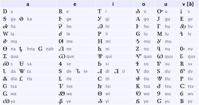
Let's take a look at the Cherokee syllabary and start to think about the shrinking-down process [image taken from Wikipedia]:
I want to start by looking for ornamental vs. productive parts of the letterforms (my terminology). For examples, let's look at the syllable pairs Ꭱ 'e' and Ꮢ 'sv', and Ꮃ 'la' and Ꮤ 'ta':
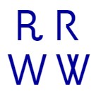
Suddenly, little aspects of the letterforms make a significant difference! In English, the joint at the middle of the letter W is (for our purposes) ornamental since the meaning/pronunciation of the letter does not change. To a Cherokee speaker, that joint is productive since it differentiates the syllables 'la' and 'ta'. For fun, let's also look at the syllables Ꭷ 'ka', Ꮼ 'wo', Ꮄ 'le', and Ꮷ 'tsu':
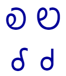
There are quite a few sets of Cherokee characters that need careful consideration because of how similar they may look (especially to the eyes of a non-speaker).
NOTA BENE: It wouldn't make sense to only look at one typeface and use that to definitively state what parts of a letterform are ornamental or productive. I based my observations on Digohweli, as well as fonts by the talented, thoughtful Joseph ᎧᎾᏘ Erb.
Now we know which aspects of the characters' geometry we want to preserve, but we still have to make the tiny shrunken letters. By and large, 8-bit games (like those for the NES) use monochrome fixed-width characters, 8 pixels square, to represent text. This means some of the productive pieces are going to have to get shrunk or blown up relative to their neighbors. For example, let's take a look at the delightfully squiggly Ꮸ 'tsv' and the whitespace gap in Ꮡ 'su'. I've put them side-by-side with the 8-bit characters I made (you'll see the whole 8-bit syllabary in a bit).
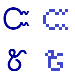
I think this is the most visually jarring part of the tiny-font-making process. Compact (but meaningful) strokes and whitespace have to be blown up! It's just something that has to happen, and the best I can do is try to blow them up tastefully.
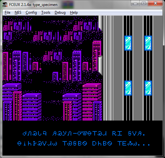
Finally, we get to the result of all this thinking and drawing: 8-bit characters!
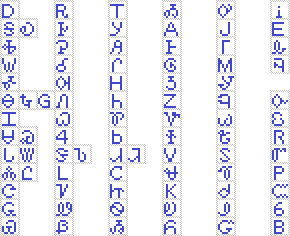
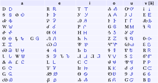
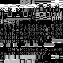
The next pictures are from Mega Man II. I patched a Japanese ROM to replace the kana with my font; the greyscale picture is an excerpt from the ROM graphics block, where I've inserted the Cherokee characters. I replaced the intro text with the Antarctica article on Cherokee Wikipedia, just to test appearances.
Next steps
- Get more feedback on the letterforms! When I showed them to Joseph ᎧᎾᏘ Erb, he had very kind words for the project overall. But for the font, he said (and I quote) "I think most of it looks pretty good." But he and I both know there's room for improvement!
- Do an actual translation and release it! Of course, I can't do this alone, because I don't speak Cherokee. I also need help identifying games that are good candidates for translation.
- Make more fonts for more writing systems! The ROM-hacking method is a fairly crude way of inserting fonts into games, so it would be extra hard to do scripts like Tibetan, Yi, Burmese, Arabic, et cetera, et cetera....I think Thaana or Georgian would be good to try next.
- Or, instead of making new 8-bit fonts, let's just translate games into languages that use the Roman alphabet! Let's localize games for Hawaiian, Quechua, Cornish, Anglo-Saxon, Neapolitan, good GOLLY I love thinking about languages.
